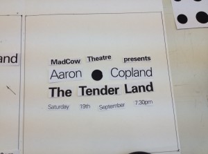
We did a point, line and form exercise in our workshop time. It was called a ‘basic typographic composition design’ exercise. The objective was to allow ourselves to visualise the basics of a design using only compositional typography as an element of point, line and form.
We had to draw ten 200mm squares then using the squares as a frame we experimented with pleasing, eye catching and readable arrangements which used the type provided in combination with a black circle to make compositions within the space. The circle represented the point, the type represented the line and the paragraph of text represented the form.
I found it difficult at first but once I cut out all the relevant pieces and started to experiment with different compositions in the frame it was easier to visualise want works and what didn’t. I didn’t stick anything down at first so I could change it if i decided something could be improved in the composition. I also experimented by cutting individual words and letters to make a more interesting and eye catching composition.


